Portfolio
Examples of my client work and personal projects
Examples of my client work and personal projects
The United States Geological Survey (USGS) reports earthquakes happening in real-time across the globe.
I designed and built a dashboard to visualise real-time earthquake data on an interactive map of Earth. It was designed desktop-first with creative solutions to preserve functionality on smaller screens and mobile devices.
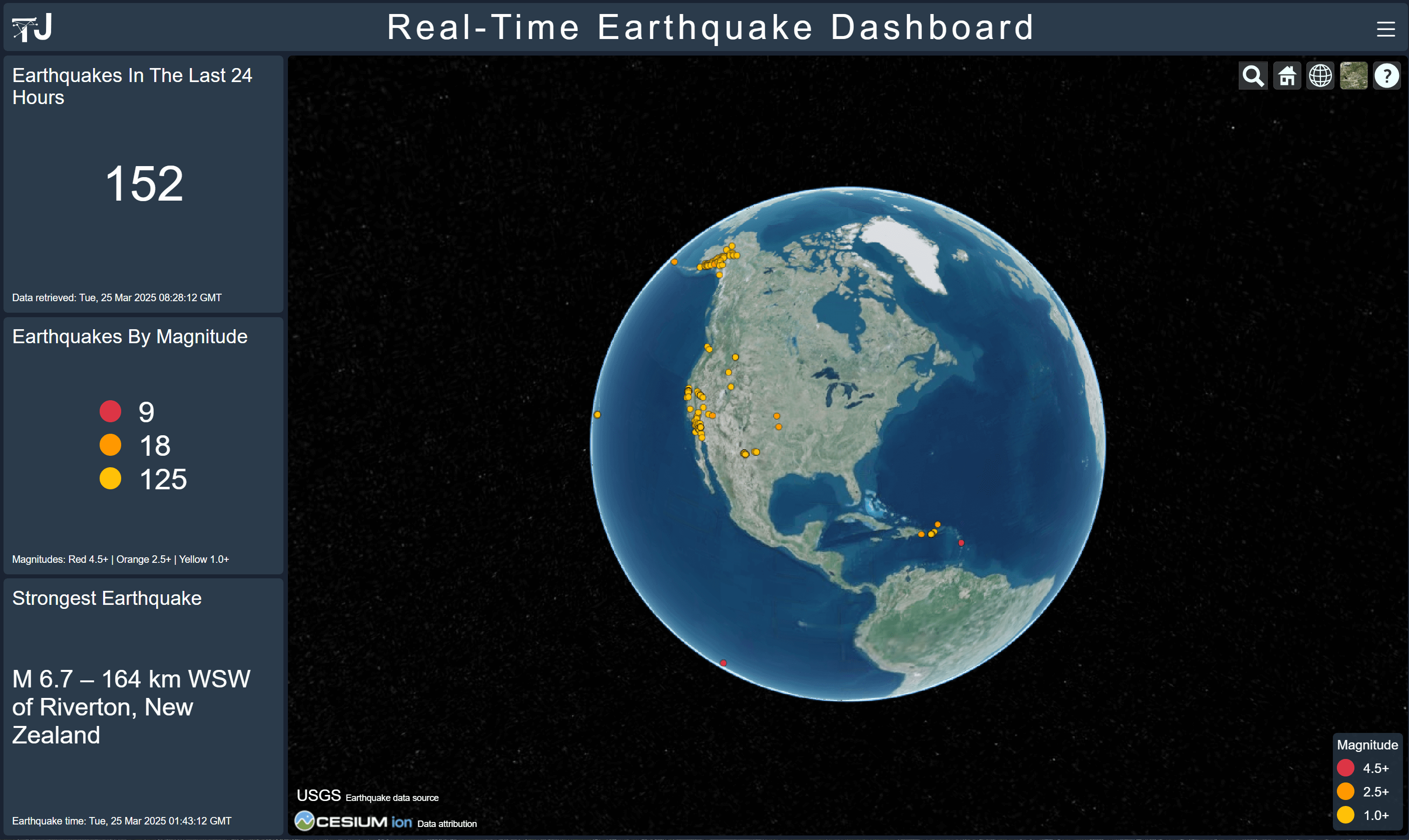
This dashboard allows you to explore Earth using a mouse or touchscreen and displays a series of points representing earthquakes that are coloured by the magnitude (strength) of an earthquake. Some of the key stats are displayed in the information boxes and you can filter data by clicking the menu located on the top-right of the screen.
Tools
Geological Survey API
Cesium ion REST API
Vanilla JavaScript
The dashboard is accessible online. The source code for this project is available on GitHub.
ClimateUEA are a multidisciplinary team of world-leading experts in climate science whose research informs policy and shapes global responses to climate change.
This app is one of several web applications I developed for my clients at ClimateUEA. See Featured Project for more details.
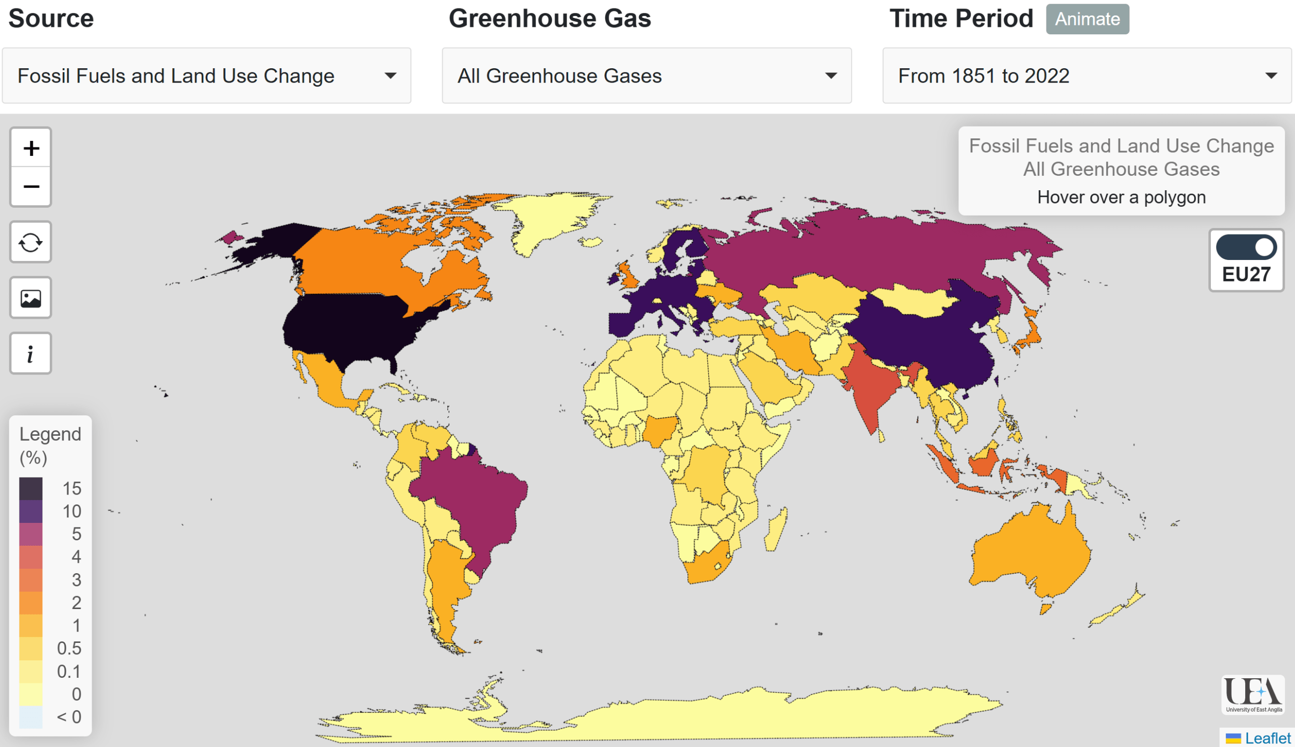
This interactive app allows you to explore the contributions of each country to global mean surface temperature (GMST) across different time periods since 1851. National contributions are displayed for three greenhouse gases: carbon dioxide (CO2), methane (CH4), nitrous oxide (N2O), and the sum of all three gases. The EU27 toggle aggregates or disaggregates the contributions from EU27 member states.
ClimateUEA are a multidisciplinary team of world-leading experts in climate science whose research informs policy and shapes global responses to climate change.
This app is one of several web applications I developed for my clients at ClimateUEA. See Featured Project for more details.
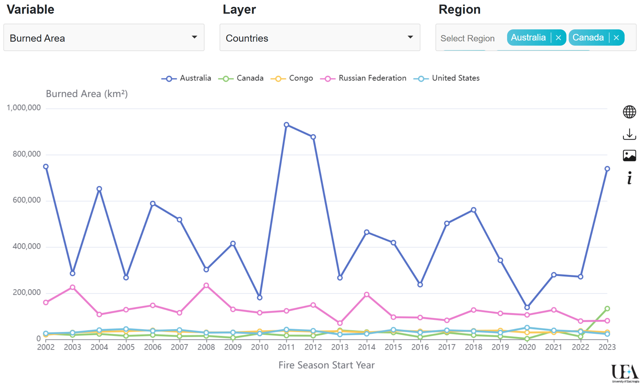
This interactive app allows you to explore burned area, emissions, fire count, fire size and fire rate of growth from 2002-2024. You can filter by variable, layer and region. For example, you can change the default settings to show the number of fires for continents. You can also download the data shown on the time series and a screenshot of the chart by clicking the corresponding icon located on the top-right of the time series.
ClimateUEA are a multidisciplinary team of world-leading experts in climate science whose research informs policy and shapes global responses to climate change.
This app is one of several web applications I developed for my clients at ClimateUEA. See Featured Project for more details.
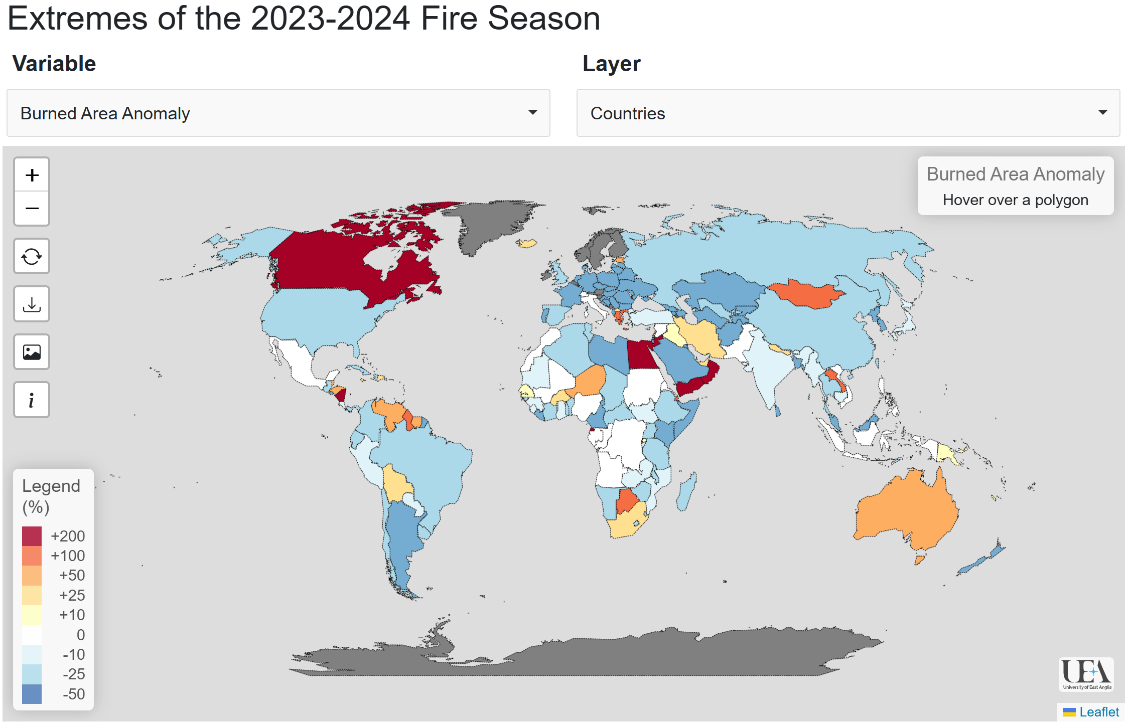
This interactive app allows you to explore anomalies in burned area, emissions, fire count, fire size and fire rate of growth in the 2023-2024 fire season compared to previous fire seasons since 2002. The colours represent percentage departures in each metric from their average values.
The National Center for Biotechnology Information (NCBI) hosts one of the largest genome assembly databases, which can be accessed through its open-source NCBI Datasets API.
I designed and built a web application to show and compare commonly desired metrics across genome assemblies. The app works by fetching data via the API and processing the result to render an interactive table and, if available, an interactive barchart of BUSCO completeness.
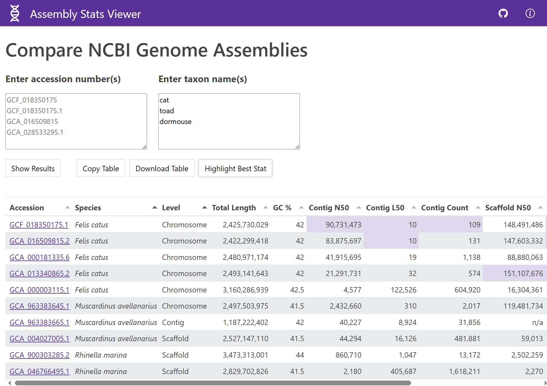
The idea behind this app is that users can quickly find out if a genome assembly exists for a particular species, and/or can rapidly assess and compare the quality of different genome assemblies. You can search by the accession ID of a genome assembly or by taxon names. For example, you can type in common names of animals or plants, or scientific names of species or higher classifications.
Tools
Node Package Manager
Bootstrap
Apache ECharts
The app is accessible online. The source code for this project is available on GitHub.
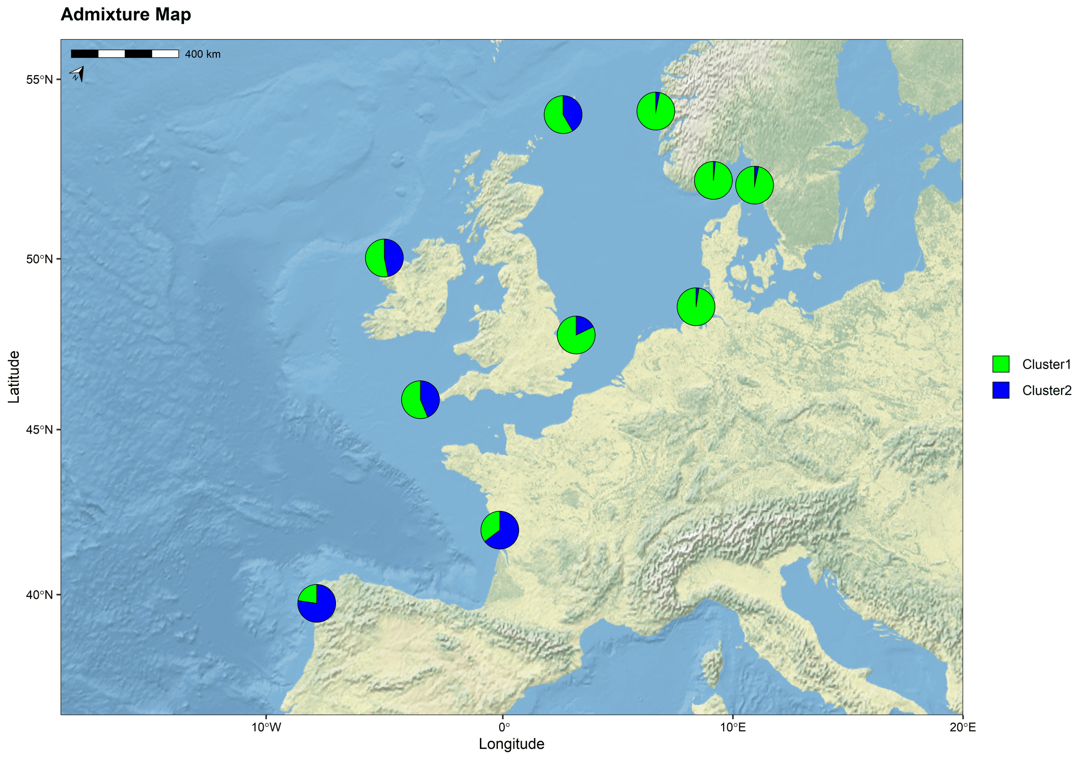
The mapmixture R package allows users to plot admixture or ancestry data for individuals or populations on a projected map. There is also an online Shiny app which allows users to explore their data interactively.
I developed this package for scientists and researchers in evolutionary biology as an easy-to-use tool for creating informative, highly customisable, publication-quality figures of admixture and ancestry datasets.
Research Article
mapmixture: An R package and web app for spatial visualisation of admixture and population structure
GitHub
Source code and development version
Interactive Version
Shiny web application
ClimateUEA are a multidisciplinary team of world-leading experts in climate science whose research informs policy and shapes global responses to climate change.
This app is one of several web applications I developed for my clients at ClimateUEA. See Featured Project for more details.
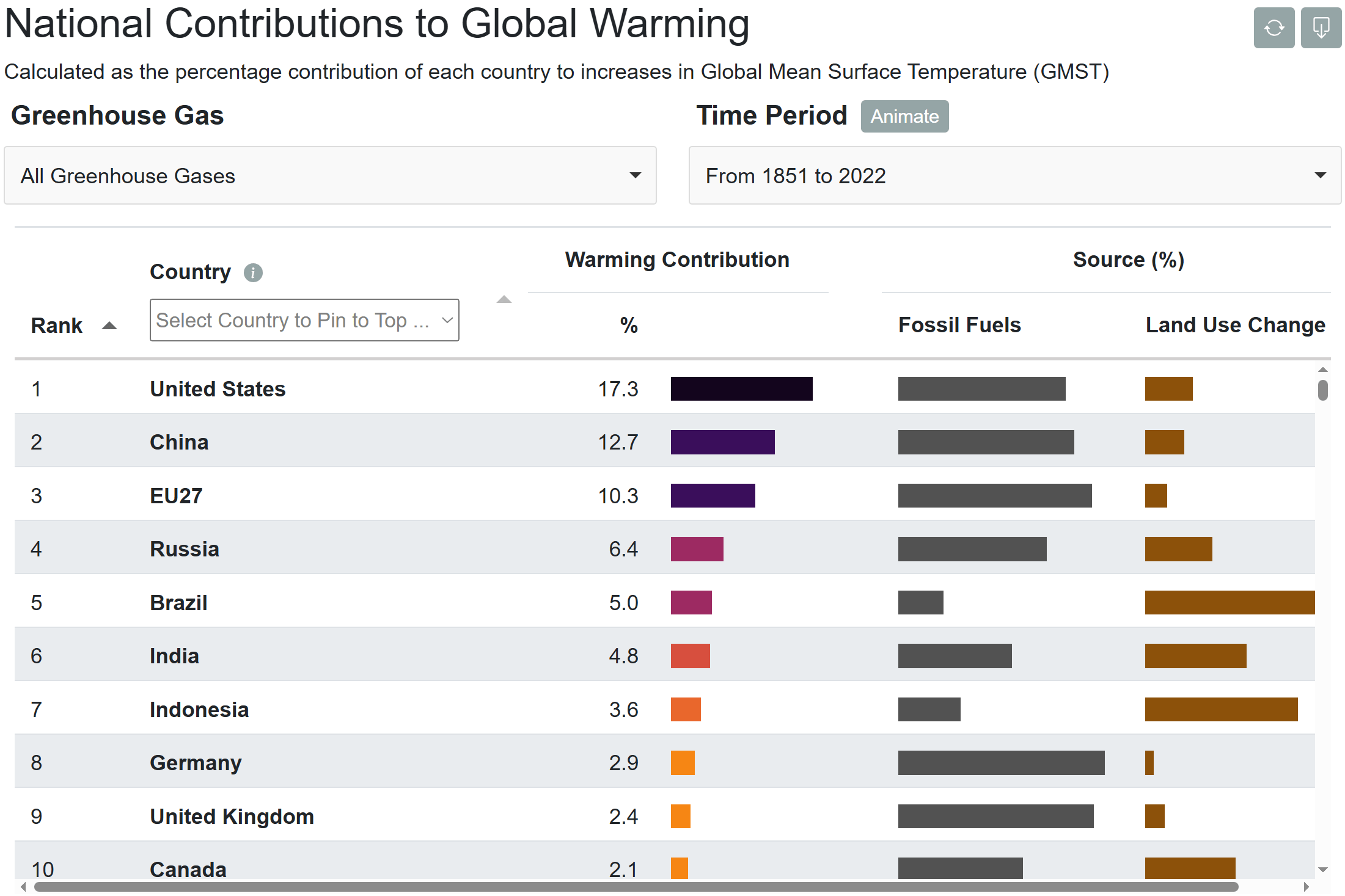
This interactive app allows you to explore the contributions of each country to global mean surface temperature (GMST) across different time periods since 1851. National contributions are displayed for three greenhouse gases: carbon dioxide (CO2), methane (CH4), nitrous oxide (N2O), and the sum of all three gases. The table is interactive and allows you to pin countries to the top by clicking a row.
I am part of a team of scientists whose aim is to sequence and assemble the first reference genome for the European lobster (Homarus gammarus). This will be an important genomic resource for future research in crustacean evolutionary biology, longevity and immunity.
I designed and built a React web application that will accompany the research article (in prep) which allows users to view expression profiles for protein-coding genes across different tissue types. The genes were annotated by the Ensembl annotation pipeline. You can find out more details about each gene by clicking the gene ID located at the top-left of the chart.
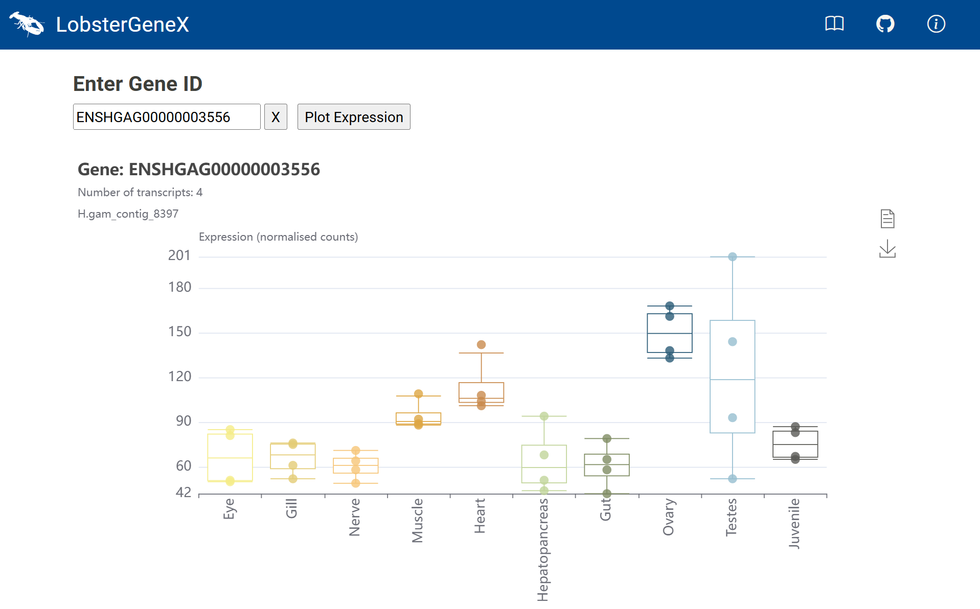
One of the design advantageous of this app is that no server is needed to host the data. This is because a database in CSV format is read when the app first loads, including rendering 23,223 items in the gene ID dropdown selector (a HTML datalist tag). The initial load can take up to a few seconds on the clients browser, which is why there is a nice DNA loading spinner to keep the user engaged while the content loads behind the scenes!
Tools
React
Vite
CSS Flexbox
Apache ECharts
The app is accessible online. The source code for this project is available on GitHub.
Nextflow pipelines is a GitHub repository containing a number of scripts written in Nextflow and Python to automate bioinformatics analyses of sequencing data. The pipelines can be easily installed and executed on any operating system (Linux recommended) using conda environments. Pipelines range from trimming and aligning paired-end reads from Illumina sequencing to classifying reads using Kraken2, quantifying expression using Kallisto, and calling variants using Freebayes.
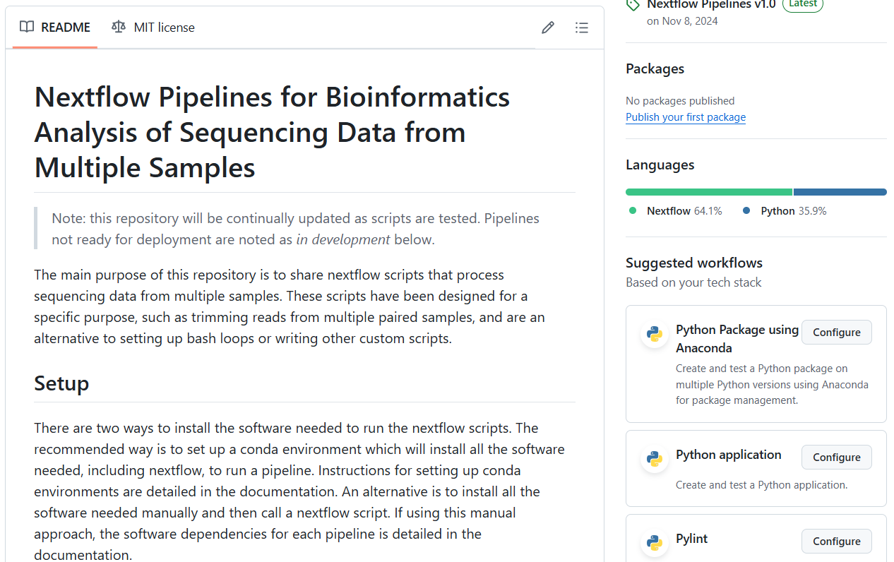
The source code for these scripts are available on GitHub.
I designed and developed this website for Tom Jenkins Data Visualisation using vanilla JavaScript, CSS and HTML. The layout is built using CSS Flexbox, ensuring a responsive and seamless experience across different screen sizes and touchscreen devices. I also built several components to enhance the user-experience, including an accordion (Featured Project), an interactive carousel (Testimonials), and popup cards (Portfolio).
